

Most consumers can become distracted easily, which often means they need to be guided through the conversion process. If you aren’t using landing pages with targeted content to lead visitors to the next step in the marketing funnel, you may be missing out on important opportunities to convert. Read on to find out why creating and optimizing landing pages is important for increasing conversions.
Why You Need Optimized Landing Pages
How many times have you found yourself getting online to buy or do something specific but then you wind up clicking around on the internet and forgetting what you came to do?
You’re not alone.
This is exactly the same situation that many of your customers find themselves in when browsing online. While updating their Facebook, one consumer might click on an ad for a product and somehow wind up watching YouTube videos all night. While another may go online to research a service on Google and end up getting into a Twitter conversation.
Humans have short attention spans, and it’s no stretch to say that the internet is full of distractions. Businesses only have a few seconds to engage their audience. Once your business has the attention of your audience, you only have a few more seconds to influence the conversion.
This is where landing pages come in. A landing page is the first page that a visitor “lands” on when they click on your ad, email, or link. This page is designed to narrow in on just one subject and guide the reader to a specific action that you’d like them to perform.
Landing pages are more effective at increasing conversions that your standard web page because they are designed to make the path to conversion as easy as possible. Not only do they use targeted and strategic language to influence the conversion, but they also help cut down on distractions, helping the consumer focus and finalize their conversion, whether that’s a purchase, a download, or even to fill out a contact form.
Let’s look at an example landing page to see how each element works together to guide the visitor to the next step in the process.
The landing page opens with a question to visitors – Buying a used car? This helps to establish relevancy right off the bat. The page then goes on to provide some brief content that speaks to the visitor’s pain points as well as the value that CARFAX can provide. The visitor doesn’t want to end up buying a used car that’s no good. CARFAX addresses this problem by offering a “detailed vehicle history report.”
At the top of the landing page, you’ll see a quick option to convert. Customers who know what they want can immediately put their VIN number into the form and submit it. However, not everyone will be ready to convert right away. For those that need a little more convincing, they can also view a sample report to “try before they buy.” Those that still need convincing can read more about what the vehicle report offers toward the bottom of the page.
This landing page provides the most important information right at the beginning. This helps those visitors with a short attention span decide very early on if they will get any value from the product that’s being offered. For those that need more information, they can simply scroll down to better understand what’s being offered and make a decision.
The page also helps guide the visitor toward conversion. Instead of giving them a million different options, they provide just two – get your report now or check out a sample report. If the visitor had ended up on the company’s home page instead of this landing page, they would have had more options and distractions, which might impact their potential to convert.
5 Landing Page Optimization Tips
Now that you know what landing pages do and why they’re important, let’s talk about how to optimize yours for better conversions. Use the tips below to make sure that your landing pages are maximizing your visitor conversion potential:
Landing Page Optimization Tip #1 – Make sure branding is clear and consistent.
Whether visitors are reaching your landing page from an email, an ad, or a link located somewhere else on your site, you want to make sure that the landing page they encounter includes branding that’s consistent with your site and other assets. This helps to set your brand apart from competitors while also creating a more seamless experience for the visitor.
When it comes to branding, make sure that you are using the same logo, colors, and types of images on your landing page as those that can be found on your site. You should also make sure that any written content on the landing page is written in the same style and voice as the rest of your brand’s content.
Here’s an example of a clean and simple landing page design that stays true to Trulia’s branding:

Not only is the logo displayed at the top of the page, but the colors and images are in line with Trulia’s brand. The copy is simple, but to the point, quickly leading visitors to the conversion.
Landing Page Optimization Tip #2 – Limit the amount of actions the visitor can take.
Landing pages should limit the amount of distractions for the visitor while guiding them onto the next step toward conversion. This means that the options a visitor can take on the page should be limited. The more links, buttons, or other options that the visitor has, the more likely they will be to become distracted, or worse, overwhelmed.
In the CARFAX example above, there were two options for the visitor. They could either go straight to conversion or get a sample before converting. However, most landing pages just offer one option – the one that leads visitors straight to conversion. Here’s an example of an effective landing page that limits options:

There’s only one thing that a visitor can do when they reach this page. They have to choose the amount of debt they have before they can continue on through the conversion process. By only providing one option, this landing page makes it impossible for the visitor to become distracted or overwhelmed by the conversion process. Once they finish one step, it’s on to the next until the process is complete.
Landing Page Optimization Tip #3 – Provide a unique value proposition.
Your value proposition tells the visitor what they will gain from your product, service, or offer. For best results, you’ll want to provide this unique value clearly and quickly at the top of the landing page. This helps catch the reader’s attention and encourage them to take action.
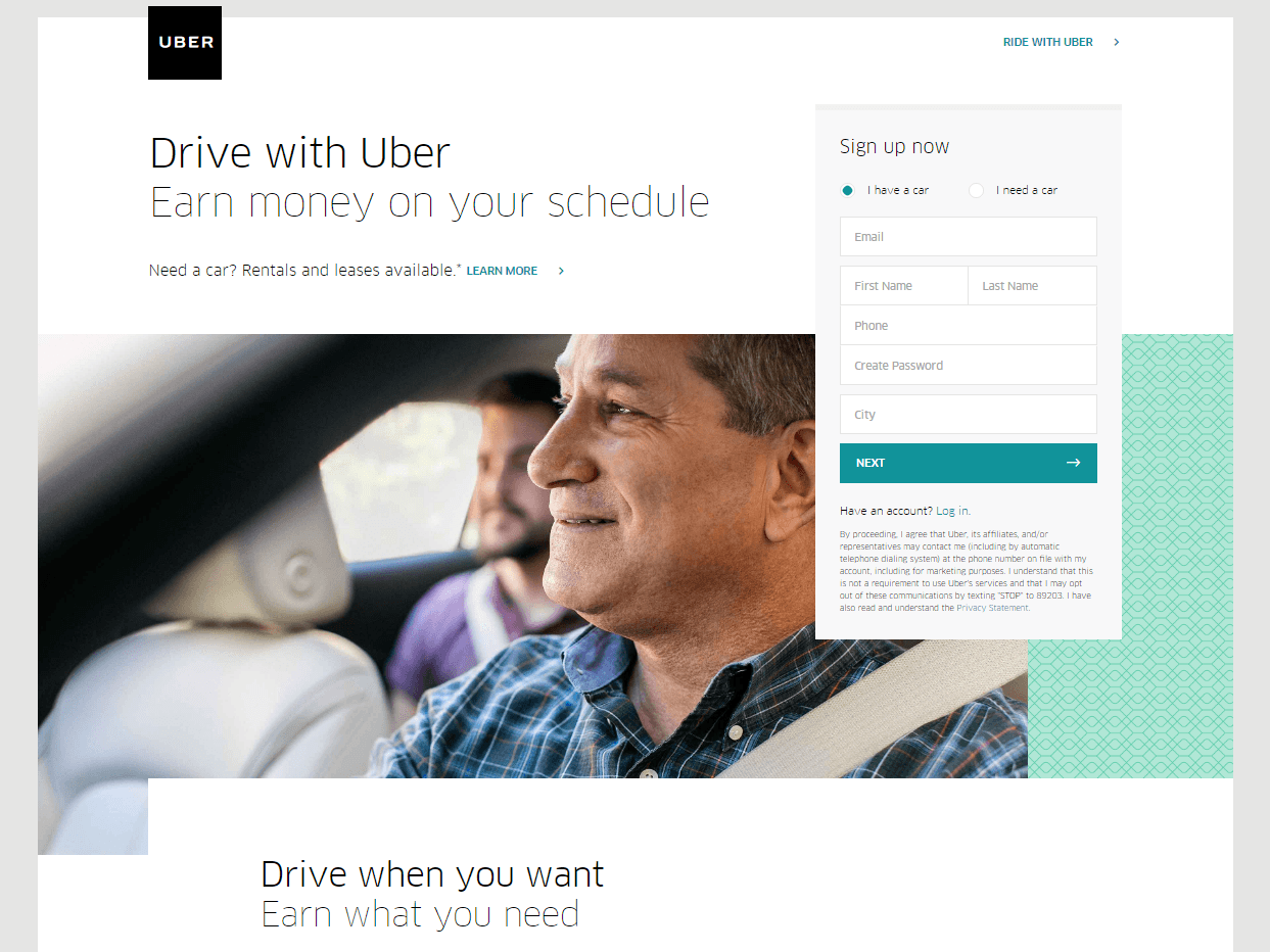
Here’s an example of a unique value proposition that’s effective:

This landing page for Uber tells visitors exactly what they will get by becoming an Uber driver – the opportunity to earn money on their own schedule. This messaging isn’t buried in the landing page copy but rather right up top, front and center as part of their heading.
Landing Page Optimization Tip #4 – Include a clear call-to-action.
To better optimize your landing page, make sure that the call-to-action is clear. Visitors can’t take the next step toward conversion if they don’t know what that is. You can create a clear call-to-action by using both copy and design. Make sure that the CTA uses active verbs to let the visitor know what the next step is. You should also make the call-to-action stand out by using a button or a clearly marked link.
Here’s an example of an optimized landing page with a clear and strong CTA:

This call-to-action leaves nothing to the imagination. The form field prompts the visitor to enter their zip code, while the CTA button tells them exactly what happens next.
Landing Page Optimization Tip #5 – Make the path to conversion as easy as possible.
If you want people to convert, you need to make the conversion process as easy as possible. Rather than having visitors click through a bunch of steps or input field after field of information, just stick to the essentials. Only ask visitors to do what’s necessary in order for them to convert.
Asking for too much information or including too many steps in the conversion process can turn some visitors away. By making the next steps toward conversion clear, quick, and simple, you ensure that there’s no guesswork or frustration when it comes to conversion.
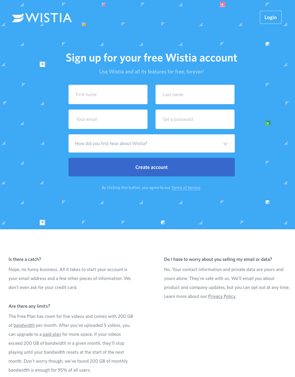
Here’s an example of a simple yet effective landing page from Wistia:

This page tells the visitor exactly what they need to do next – sign up for a free account. Then, the form asks for a first and last name, email, password, and how the visitor learned about Wistia. This is just enough information to get the user set up with a free account while helping Wistia better understand their lead sources.
To complete the conversion, all the visitor has to do is click on the “Create Account” button, which is located at the bottom of the form. The button is big and a different color, making it impossible to miss. This is a landing page that offers no confusion or frustration, just a straightforward conversion.
Need help creating landing pages that convert? The team at SevenAtoms provides landing page design and conversion rate optimization (CRO) services to help you turn more leads into customers. Contact us today to find out how we can transform the way you think about landing pages.


